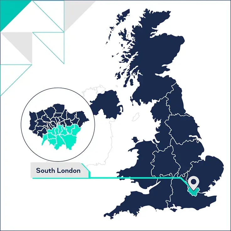
The highest average house prices in the country are in London but there’s a lot of fluctuation even within the city.
We want to take a look at how much of a factor the location of boroughs has on house prices, using South London as a case study. Alongside this, we’ll be comparing the impact of shifting demographics, housing delivery, and income.
For this blog, we’ve included the following South London boroughs: Merton, Croydon, Sutton, Wandsworth, Bexley, Bromley, Lambeth, Lewisham, Greenwich, Kingston, and Southwark.
Out of these 11 boroughs, six are in Outer London and five are in Inner London.

South London demographic data
South London’s inner boroughs are more densely populated than the outer ones. Lambeth is the most densely populated with 11,843.8 people per sqkm, followed by Southwark with 10,609.4 people per sqkm.
Bromley is not only the borough with the lower population density in South London at 2,196.9 people per sqkm but the lowest in the entire capital.
Read our Regional Market Report: London for more demographic data broken down by borough.
The ONS’s population forecast for 2031 shows fairly level population growth across South London – and there’s not as clear an inner vs outer London divide as there is with current population density. Southwark is expected to see a 12% increase in 10 years and Kingston upon Thames is set to experience a 9.5% rise.
Merton is the only South London borough expected to see a negative population growth at -3.8%.
Let’s take a look at the extent to which population changes have a role to play in house prices.
Housing market in South London
House prices in South London
From the chart, we can see that (out of the South London boroughs) Bexley had the highest change in average house price from December 2012 to 2022 at 101%. Despite this significant uplift, they still have the lowest average house price out of all South London boroughs.
The three boroughs with the lowest increase in house prices were all in Inner London (and two were the most densely populated) – Wandsworth (56.2%), Southwark (59.5%), and Lambeth (59.5%). Likely because the price baseline in 2012 was already significantly higher than the boroughs which saw more significant growth.
Wandsworth has the highest house prices in South London – with the average house price sitting at £675,123. Merton was next (£594,930), followed by Kingston upon Thames (£570,307). All of these boroughs are located in the South West of the city.
But how do these prices compare to the median income in South London?
Income to house price ratio in South London
When we add median income data into the mix, we get a better picture of the affordability of housing in these boroughs.
Bexley had the lowest earnings to house price ratio in 2022 at 10 – meaning that the gap between median income and the price of the average home is the smallest in all of London. This is particularly interesting to note as they experienced such a high 10-year increase in house prices.
Croydon, Greenwich, and Bromley also ranked low on the scale (11.2, 11.7, 12.1 respectively).
The two priciest boroughs in South London (Merton and Wandsworth) also had the highest earning to house cost ratio at 15.6 and 13.7 respectively.
Again, there doesn’t seem to be a clear link between the boroughs’ location in either Inner or Outer London but there is a stronger East versus West divide.
Next, we’ll take a look at the relationship between new home delivery and prices.
Housing delivery in South London
South London has seen some huge regeneration projects get underway in recent years – with Nine Elms in Wandsworth being one of the biggest.
The row of luxury tower blocks that have gone up along the stretch of the Thames in Nine Elms has brought a lot of new housing onto the market.
For the last three years (from 2018-2021), the Housing Delivery Test (HDT) has shown that delivery in Wandsworth has been exceeding the local requirement. The borough also had a high new-build premium of 18.39% in 2021.

The Nine Elms developments, however, have not been without their share of controversy. Some critics are labelling it as out of reach for the majority of local inhabitants – and a haven for foreign investors with flats lying empty. As we saw before, Wandsworth has the highest house prices in South London and the second highest average earnings to average house price ratio – going some way to confirm that local inhabitants may be priced out of the market.
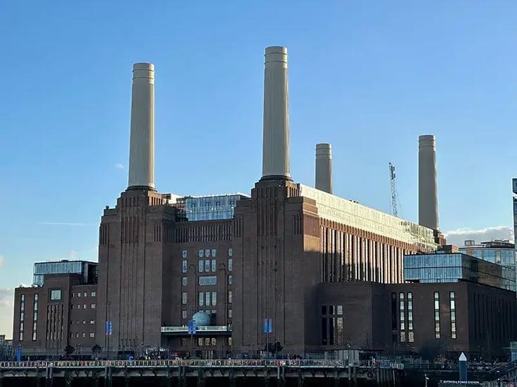
The recent opening of the Battersea Power Station tube station has also improved accessibility to these developments and could be a factor in driving up house prices.
To find out more about the impact of infrastructure read our blog post here.
What is the biggest driver of house price fluctuations in South London?
A number of factors are contributing to the differing levels of house price growth across South London. From projected population figures driving up demand in certain boroughs, to regeneration projects bringing in an influx of new housing stock.
However, the strongest correlation we found was between location and house prices. Not Inner versus Outer London though, but rather, South West versus South East. This article from the Guardian helps to explain some of the reasons why that is.
The top three highest house prices were in the South West, and the three lowest were in the South East. Similarly, in terms of house price growth over the last 10 years, we can see a similar split with boroughs in the South East seeing a bigger uplift than boroughs in the South West.
As a developer, knowing where prices are expected to rise and fall is key to getting strong returns on your project. But being able to access this data in seconds can be a game-changer for how you run your business.
Get comparables data for your target areas
With LandInsight, you can see how much houses have sold for in your target area.
As well as using our powerful data tools to source, assess, and manage opportunities.
Want to learn more about how LandInsight can help you to find the right site even in challenging circumstances?
Other content you might be interested in:

